


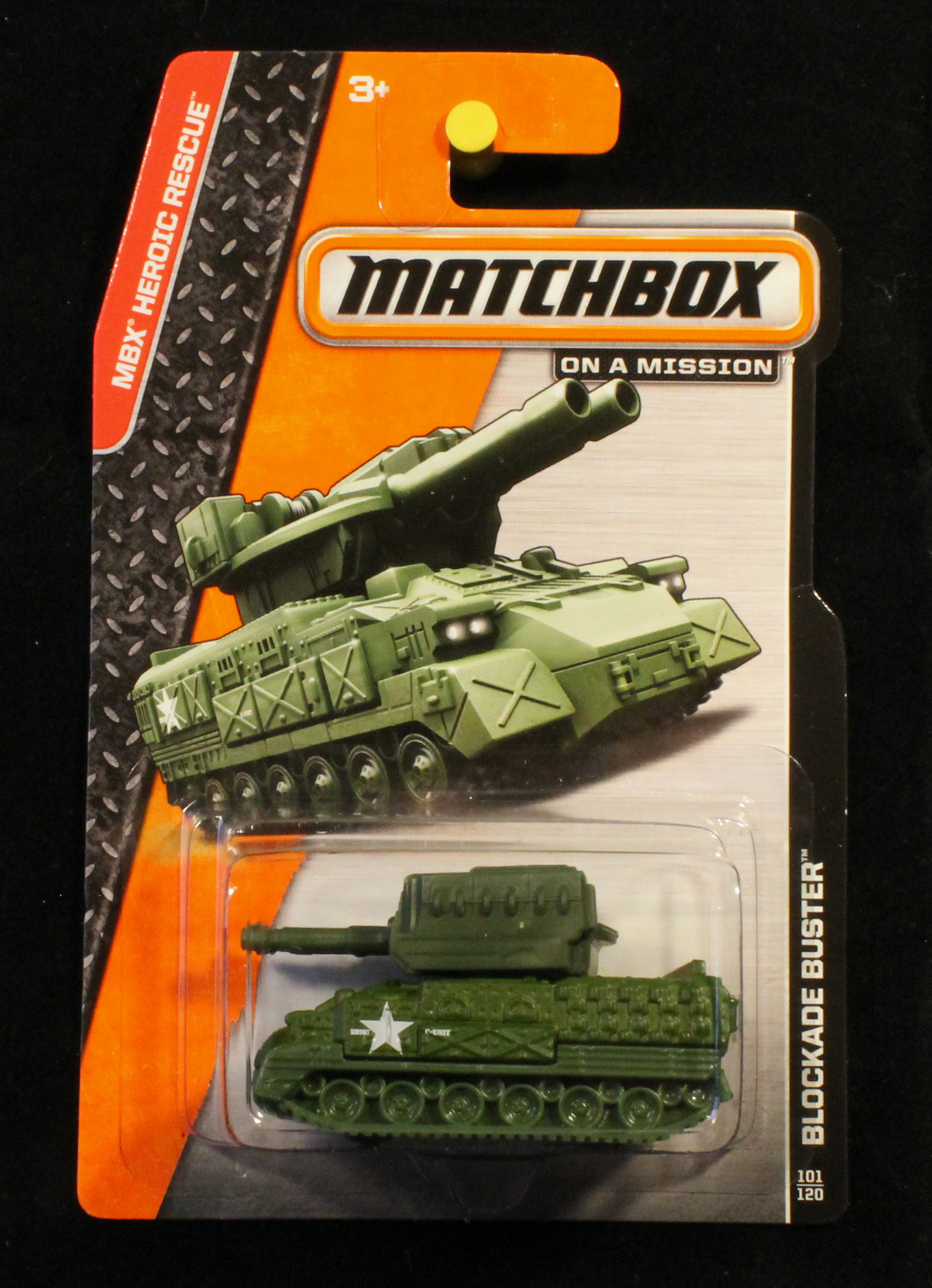
Release Themes
In post-Lesney eras Matchbox frequently based their releases for a given year or years on a particular theme. Themes typically included a variation of the Matchbox logo, colors and design of the package, and named the theme itself, or featured a unique icon for the theme. Mattel's current Matchbox theme (as of 2014) is 'On A Mission'.
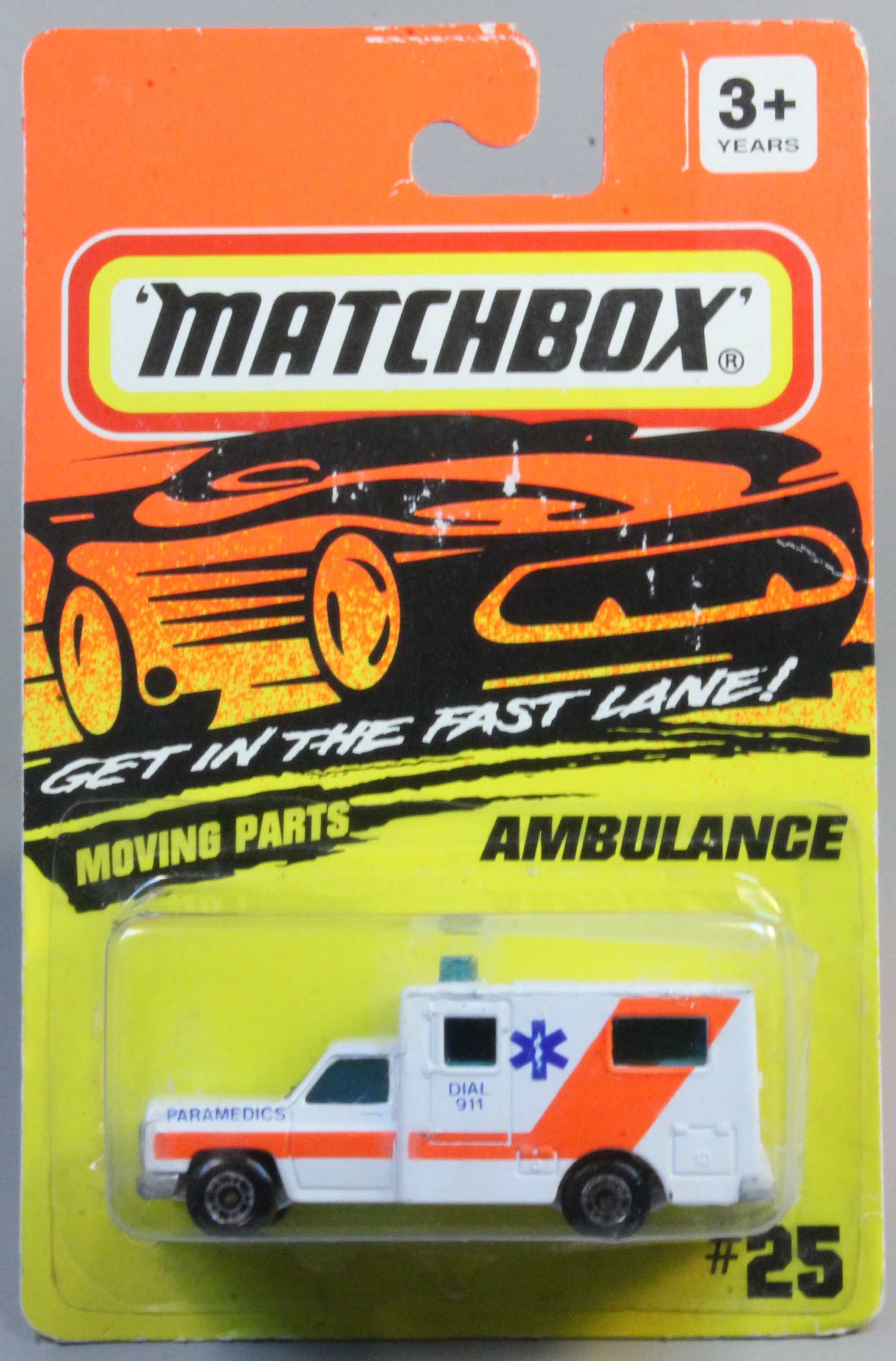
Fast Lane
This theme was used by Tyco throughout the period when that company owned Matchbox. The sale to Tyco occurre din 92 but 1994 was the first year the new theme was generally used. The theme features the lozenge Matchbox logo (first used late in the Superfast era, and carried through the Universal years), but with a white background inside the yellow & red lines. Packages were orange-fading-to-yellow with a black stylized car and, in some cases, the slogan 'Get in the Fast Lane!'
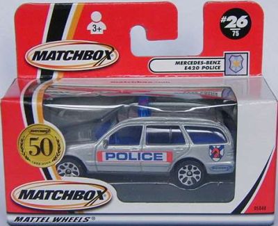
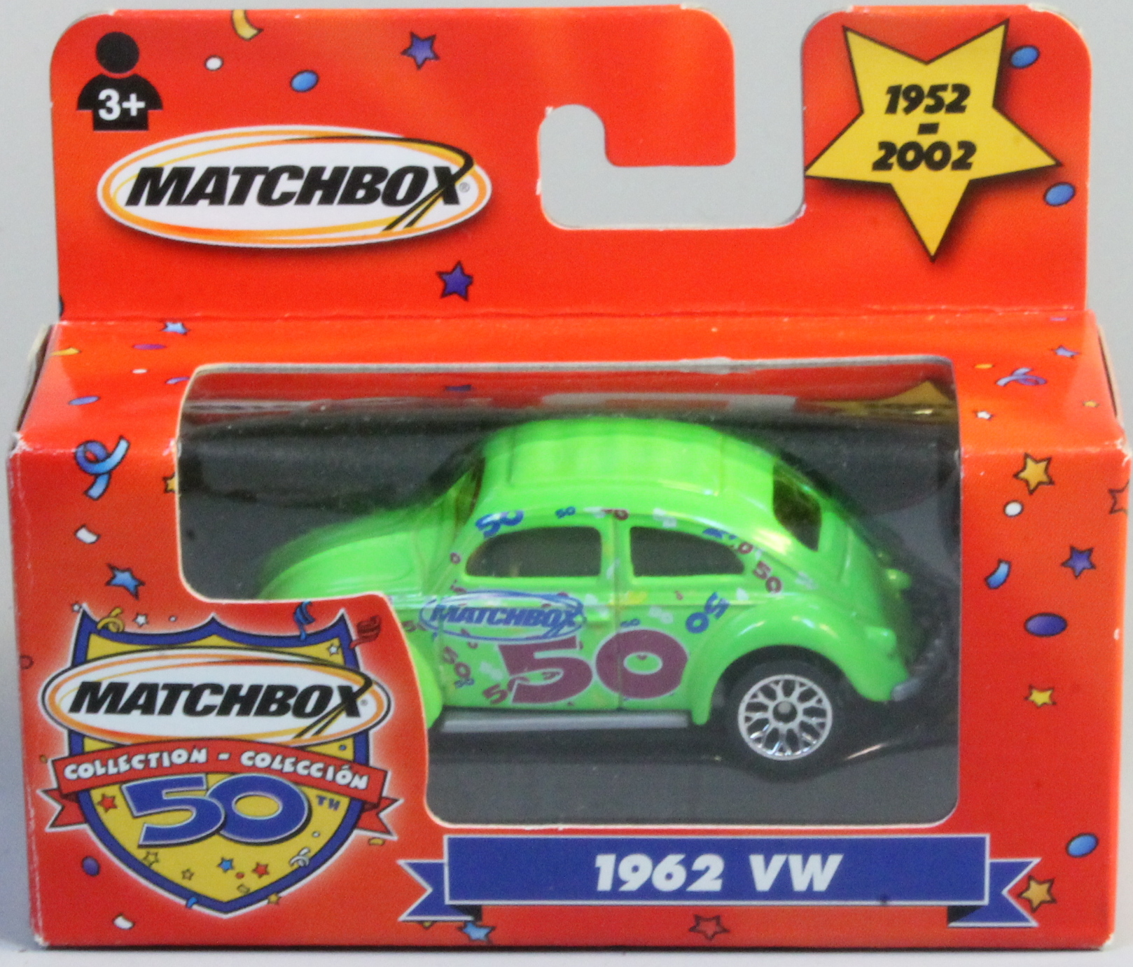
50th Anniversary
The first several years of Mattel packaging, similarly designed, were not really themed. The lozenge logo was maintained in the initial orange package w/ Ford Explorer, then in 2001 a new logo was issued along with a new package style. Red packages featured a swooping black & gold stripe, and an oval 'swirl' logo. In 2002, for Matchbox's 50th anniversary, a new theme, using this packaging, was issued- the 50th anniversary theme. The theme was used across multiple series and featured a round ,gold seal with the swirl logo, curving laurel leaves and a large '50'. It was used only for the one year.
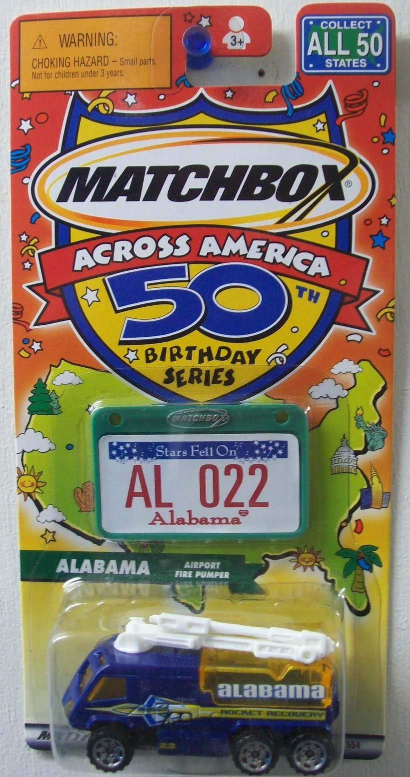
Matchbox 50th Birthday
Another birthday theme was used, also in 2002, specifically for the 'Across America' series and for a set of 4 'Birthday Collection' models. The theme was brightly colored and more oriented toward younger buyers.
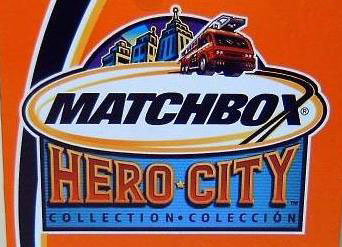
Hero City
For 2003 and 2004 Mattel used the Hero City theme for its packaging, story lines and model selection and design. Among the least popular Matchbox productions, the theme presented its range of vehicles as the means of achieving heroic adventure in the fictional Hero City. Unfortunately, with the 2004 releases, Mattel reneged on their earlier commitment to Matchbox fans to differentiate the models from Hot Wheels by introducing fanciful or fantastic models under 'Ultra Hero' sub-series. These included animal-shaped models (i.e. the elephantine Jumbo Sweeper), hat or helmet models (Cap'n'Cop) and generally tacky design on the entire series. Several iterations of package designs were used, but all featured the Hero City logo. One bright light in 2004 was the re-introduction of a parallel 'Superfast' line. This series retained the swirl logo, but ropped Hero City altogether.
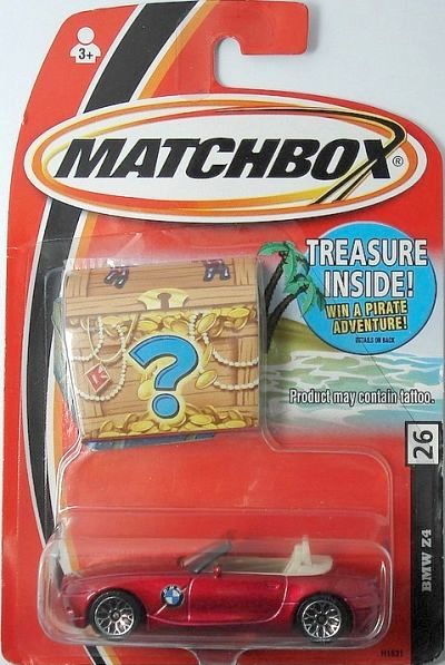
Buried Treasure
For 2005 Mattel moved out of Hero City, and introduced a new theme for the 1-75 line- Buried Treasure. These packages continued to use the swirl logo and black/gold stripe on red packages, but featured a desert island and treasure chest background for the 1-75 models. In the US the treasure chest was actually a puffed out pocket that contained a chance to win a Pirate adventure trip. The Superfast series transitioned even farther from Hero City and returned to the lozenge logo and old 'Superfast' typeface from the 70's.
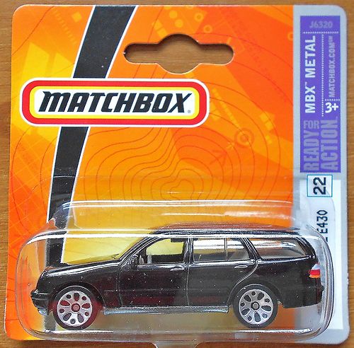
MBX Metal
From 2006 through 2009 Mattel used a more understated theme, retaining the lozenge logo and switching to a predominantly orange package. Matchbox became known within Mattel as their 'orange' brand (vs. the 'blue' Hot Wheels brand). All series included a purple info box with the 'MBX Metal' theme slogan.
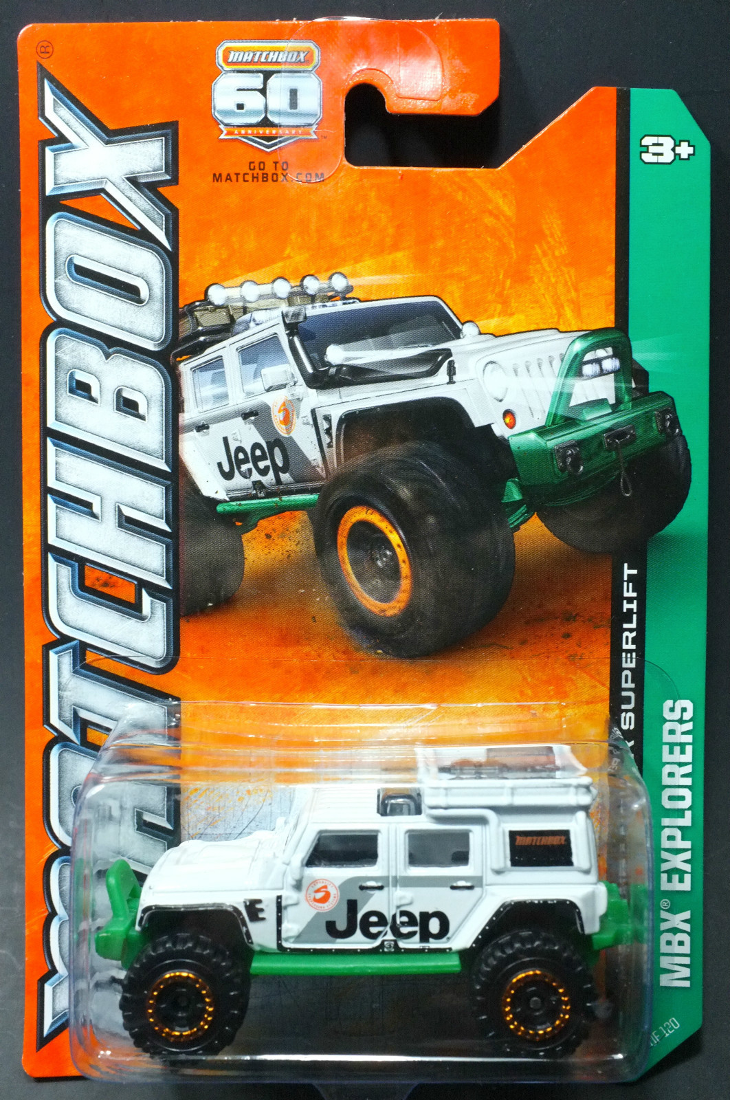
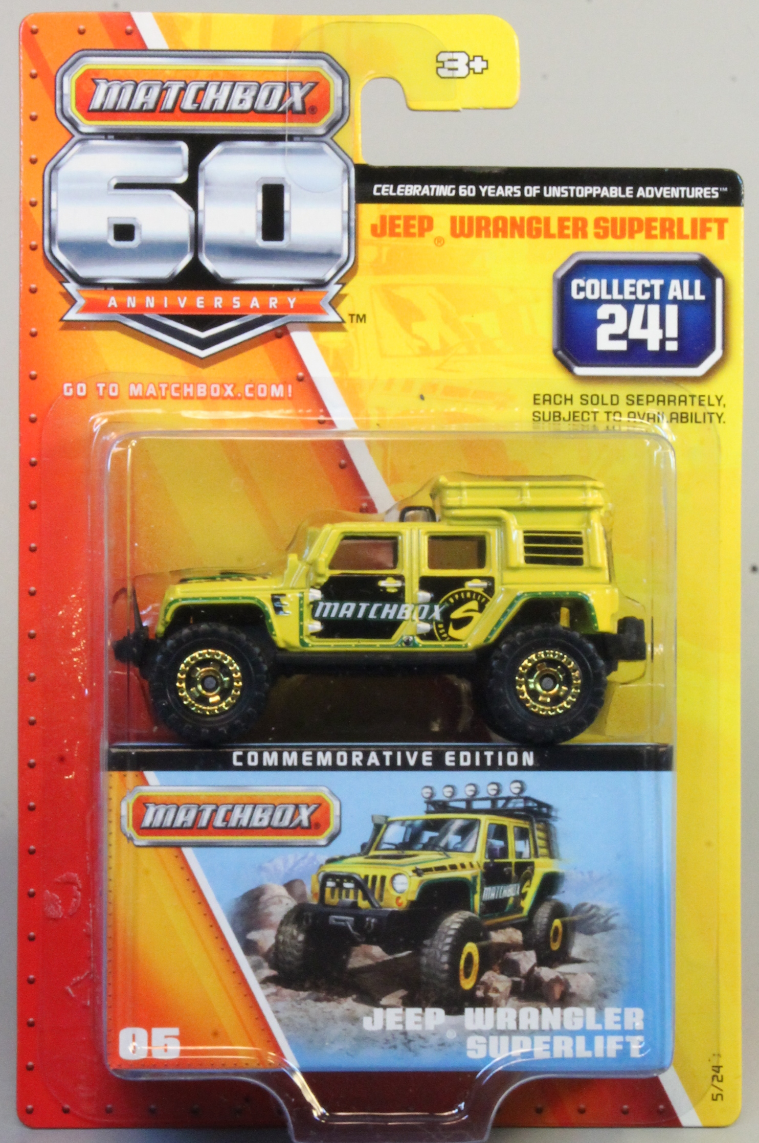
60th Anniversary
Each year from 2010 through 2013 it seemed that Matchbox got a new marketing team, with a new logo and package designs. Similar package designs were used in 2012 and 2013, with the latter year also including a 60th anniversary logo, celebrating another big birthday for the brand. This logo was included on series for the year.
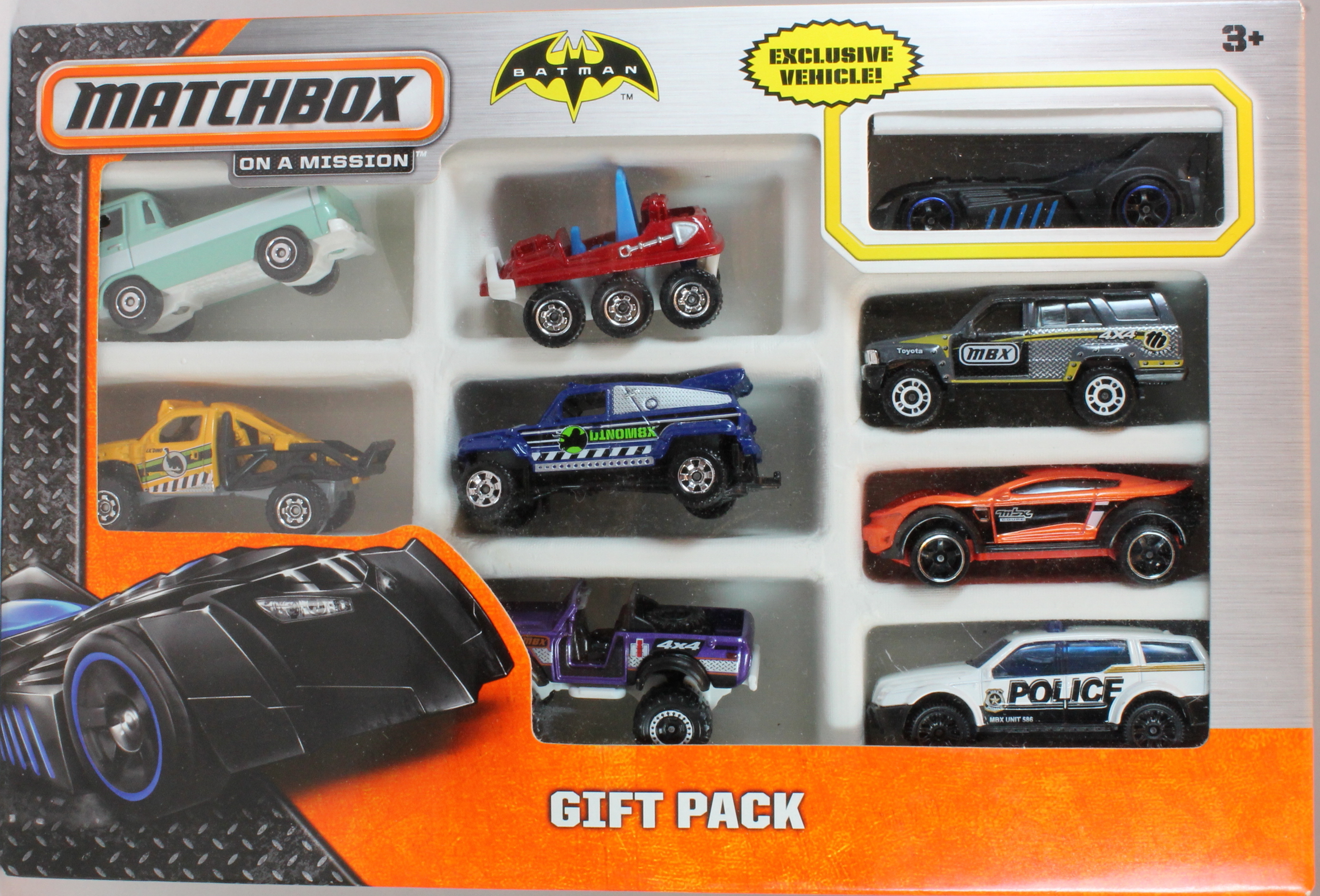
On a Mission
Once again, 2014 brought a new design style, ostensibly more traditional with a return to the lozenge logo. The 'On a Mission' theme emphasizes toughness, with a black metal grid, orange and silver color scheme. The Matchbox team seemed high on the concept, so we will see shortly if they retain it for another year.
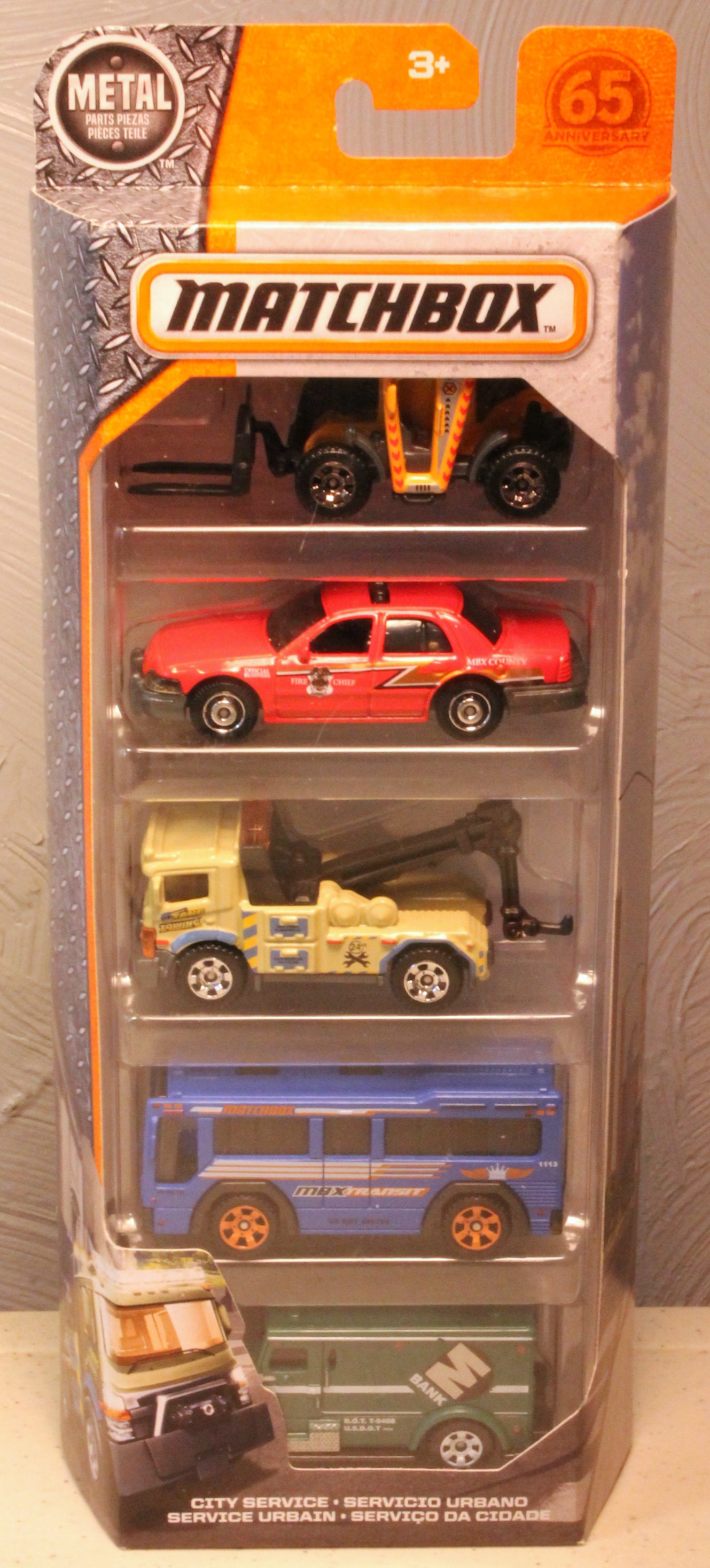
65th Anniversary
Similar to the On a Mission theme, this was created in 2017 to celebrate their 65th anniversary. The main difference is the 65th logo.